Clustering is the process of grouping similar data points to uncover hidden patterns within a dataset. The primary goal is to maximize similarity within clusters while minimizing differences between them. Various algorithms achieve this, each with its own advantages and disadvantages, helping us gain insights into complex datasets. In this analysis, I will compare and contrast three algorithms: K-means, Hierarchical clustering, and DBSCAN, which represent different approaches to the clustering problem.
| Feature | K-means | Hierarchical | DBSCAN |
| Basic Principle | Partitions data into K clusters, each described by the mean of the samples in the cluster | Creates a tree-like hierarchy of clusters | Groups together points that are closely packed in space |
| Number of Clusters | Requires pre-specification of K | Can produce any number of clusters | Automatically determines the number of clusters |
| Cluster Shape | Assumes convex, isotropic blob shapes | Can handle various shapes, but often produces globular clusters | Can find clusters of arbitrary shapes |
| Scalability | Very large n_samples, medium n_clusters | Large n_samples and n_clusters | Very large n_samples, medium n_clusters |
| Handling Outliers | Sensitive to outliers | Can be sensitive to outliers, depending on the linkage method | Robust to outliers, marks them as noise points |
| Handling Uneven Cluster Sizes | Assumes even cluster sizes | Can handle uneven cluster sizes | Can handle uneven cluster sizes |
| Memory Requirements | Low to Medium | High | Low to Medium |
| Sensitivity to Initialization | Highly sensitive to initial centroids | N/A | No |
| Parameters | Number of clusters (K) | Number of clusters or distance threshold, linkage type | eps (neighborhood size), min_samples |
| Interpretability | Easy to interpret centroids | Dendrogram provides hierarchical view | Core points, border points, and noise points concept |
| Handling High-dimensional Data | Can struggle with high-dimensional data | Can struggle with high-dimensional data | Can perform well if density is well-defined |
| Consistency | Results can vary due to random initialization | Consistent results for same parameters | Consistent results for same parameters |
| Use Cases | General-purpose, even cluster size, flat geometry | Many clusters, possibly with hierarchy, connectivity constraints | Non-flat geometry, uneven cluster sizes, noise removal |
Table 1: Comparison table
Data Preparation
To explore clustering patterns based on amino acid composition, proteins with exclusive localizations to the Nucleus, Cytoplasm, and Cell Membrane were selected. This focus on specific subcellular localizations aims to investigate whether proteins with similar localizations exhibit similar amino acid profiles that can form distinct clusters. Extracting and separating these proteins facilitates a clear comparison of clustering results. So, in essence, this approach simplifies the dataset, making it easier to analyze clustering patterns linked to specific localizations.
The Python code below prepares the data to that extent.
import pandas as pd

# Loading the data (the original CSV data)
file_path = r'path_to_Cleaned_raw_2.csv'
data = pd.read_csv(file_path)

# Defining the amino acid percentage columns to extract
amino_acid_columns = ['Percent_A', 'Percent_C', 'Percent_D', 'Percent_E', 'Percent_F',
                      'Percent_G', 'Percent_H', 'Percent_I', 'Percent_K', 'Percent_L',
                      'Percent_M', 'Percent_N', 'Percent_P', 'Percent_Q', 'Percent_R',
                      'Percent_S', 'Percent_T', 'Percent_V', 'Percent_W', 'Percent_Y']

# Extracting proteins with exclusive subcellular localization - Nucleus
nucleus_exclusive = data[data['Subcellular_Locations'].apply(lambda x: x.strip() == 'Nucleus')]
nucleus_exclusive_amino_acids = nucleus_exclusive[amino_acid_columns].copy()
nucleus_exclusive_amino_acids['Subcellular_Location'] = 'Nucleus'

# Extracting proteins with exclusive subcellular localization - Cytoplasm
cytoplasm_exclusive = data[data['Subcellular_Locations'].apply(lambda x: x.strip() == 'Cytoplasm')]
cytoplasm_exclusive_amino_acids = cytoplasm_exclusive[amino_acid_columns].copy()
cytoplasm_exclusive_amino_acids['Subcellular_Location'] = 'Cytoplasm'

# Extracting proteins with exclusive subcellular localization - Cell membrane
cell_membrane_exclusive = data[data['Subcellular_Locations'].apply(lambda x: x.strip() == 'Cell membrane')]
cell_membrane_exclusive_amino_acids = cell_membrane_exclusive[amino_acid_columns].copy()
cell_membrane_exclusive_amino_acids['Subcellular_Location'] = 'Cell membrane'

# Concatenating the data
merged_data_with_location = pd.concat([nucleus_exclusive_amino_acids, cytoplasm_exclusive_amino_acids, cell_membrane_exclusive_amino_acids], ignore_index=True)

# Saving the merged data with Subcellular_Location to an Excel file
excel_file_with_labels_path = r'path_output_amino_acid_seq_Nucleus_Cytoplasm_Cell_membrane_WITH_LABELS.xlsx'
merged_data_with_location.to_excel(excel_file_with_labels_path, index=False)

# Saving the merged data without Subcellular_Location to another Excel file
merged_data_without_labels = merged_data_with_location.drop(columns=['Subcellular_Location'])
excel_file_without_labels_path = r'path_output_amino_acid_seq_Nucleus_Cytoplasm_Cell_membrane_LABELS_REMOVED.xlsx'
merged_data_without_labels.to_excel(excel_file_without_labels_path, index=False)

# Just a little print message
print('Merging complete')
Link to the excel file that was generated form the python code above. I will be using the one without labels ofcourse but i have teh one with lables separately in an excel file. The only difference bewtten the two is jsut one column that has the label for the 3 subcellular localization.
Here are the the links to the two excel files:
1.amino_acid_seq_Nucleus_Cytoplasm_Cell_membrane_WITH_LABELS.xlsx and 2.amino_acid_seq_Nucleus_Cytoplasm_Cell_membrane_LABELS_REMOVED.xlsx

Screenshot showing the data with the Subcellular_location label .

Screenshot showing the data without the Subcellular_location label .
Normalizing the data
Python code used to normalize the no label data from above.
import pandas as pd
from sklearn.preprocessing import StandardScaler

# Loading the dataset without labels
file_path = r'path_to_amino_acid_seq_Nucleus_Cytoplasm_Cell_membrane_LABELS_REMOVED.xlsx'
data = pd.read_excel(file_path)

# Normalizing the data
scaler = StandardScaler()
normalized_data = scaler.fit_transform(data)

# Converting back to a DataFrame
normalized_data_df = pd.DataFrame(normalized_data, columns=data.columns)

# Printing the first few rows of the normalized data
print(normalized_data_df.head())

# Saving the normalized data to a new Excel file
normalized_file_path = r'path_to_normalized_amino_acid_data.xlsx'
normalized_data_df.to_excel(normalized_file_path, index=False)

print("Normalization complete")
Link to the normalized excel file : normalized_amino_acid_data.xlsx

Screenshot showing the normalized data from the code above.
Performing PCA
import pandas as pd
from sklearn.decomposition import PCA

# Load the normalized data
file_path = r'path_to_normalized_amino_acid_data.xlsx'
normalized_data = pd.read_excel(file_path)

# Performing PCA with 3 components
pca = PCA(n_components=3)
data_pca = pca.fit_transform(normalized_data)

# Getting the explained variance ratio (percentage of variance retained)
explained_variance = pca.explained_variance_ratio_
total_variance_retained = sum(explained_variance) * 100

# Print the variance retained by the 3 principal components
print(f'Explained variance by 3 components: {explained_variance}')
print(f'Total variance retained: {total_variance_retained:.2f}%')

# Convert the PCA-reduced data back to a DataFrame
data_pca_df = pd.DataFrame(data_pca, columns=['PC1', 'PC2', 'PC3'])

# Saving the PCA-reduced data to an Excel file
pca_file_path = r'path_to_pca_reduced_amino_acid_data.xlsx'
data_pca_df.to_excel(pca_file_path, index=False)

print("PCA complete")
Percentage of Variance Explained by Top 3 Principal Components
- PC1 (Principal Component 1): 21.44% of the variance.
- PC2 (Principal Component 2): 13.78% of the variance.
- PC3 (Principal Component 3): 10.11% of the variance.
After reducing the data to 3 dimensions, I retain 45.33% of the original information.

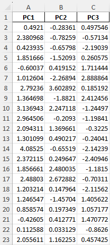
Screenshot showing PCA-reduced data as executed by the python code above .
Performing K-means Clustering with Silhouette Method
Testing k values of 2,3,4 and 5
import pandas as pd
from sklearn.cluster import KMeans
from sklearn.metrics import silhouette_score

# Loading the PCA_reduced data
file_path = r'=path_to_pca_reduced_amino_acid_data.xlsx'
data_pca = pd.read_excel(file_path)

# Defining the range of k values to test
#picking 2,3,4 and 5
k_values = range(2, 6)

# Storing silhouette scores for each k valesu listed above
silhouette_scores = {}

# Looping through each k value and computing the Silhouette score
for k in k_values:
    kmeans = KMeans(n_clusters=k, random_state=42)
    labels = kmeans.fit_predict(data_pca)

    # Calculate the Silhouette score
    silhouette_avg = silhouette_score(data_pca, labels)
    silhouette_scores[k] = silhouette_avg

    print(f"For n_clusters = {k}, the Silhouette score is {silhouette_avg:.4f}")

#cleaner data ouput visualization
# Sorting and displaing the best k values based on Silhouette score
sorted_silhouette_scores = sorted(silhouette_scores.items(), key=lambda x: x[1], reverse=True)
print("\nBest k values based on Silhouette score:")
for k, score in sorted_silhouette_scores:
    print(f"k = {k}, Silhouette score = {score:.4f}")
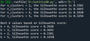
Ouput of the code above

For n_clusters = 2, the Silhouette score is 0.3381
For n_clusters = 3, the Silhouette score is 0.3693
For n_clusters = 4, the Silhouette score is 0.3920
For n_clusters = 5, the Silhouette score is 0.3254
Best k values based on Silhouette score:
k = 4, Silhouette score = 0.3920
k = 3, Silhouette score = 0.3693
k = 2, Silhouette score = 0.3381
k = 5, Silhouette score = 0.3254
Takeaway: The silhouette method shows that 4 clusters are best, with a score of 0.3920. This means the clusters are well-separated. Using 3 or 2 clusters is also okay, but the separation is not as clear. Using 5 clusters is the worst, so adding more clusters probably won’t help much for this data. The selected clusters, k=2, k=3, and k=4, will now be used to create a 3D k-means clustering plot.
3D K-Means Clustering data (k=2, 3, 4)
import pandas as pd
from sklearn.cluster import KMeans
import plotly.graph_objects as go
from plotly.subplots import make_subplots
import os

# Loading PCA-reduced data
file_path = r'path_to_pca_reduced_amino_acid_data.xlsx'
data_pca = pd.read_excel(file_path)

# Ensuring the data has the correct structure
required_columns = ['PC1', 'PC2', 'PC3']
if not all(col in data_pca.columns for col in required_columns):
    raise ValueError(f"Data must contain columns named {', '.join(required_columns)}.")

# Defining the k values we are interested in (k = 4, 3, 2 based on Silhouette scores)
k_values = [4, 3, 2]

# Creating a color map for up to 4 clusters
color_maps = {
    0: 'rgb(31, 119, 180)',  # Blue
    1: 'rgb(255, 127, 14)',  # Orange
    2: 'rgb(44, 160, 44)',   # Green
    3: 'rgb(214, 39, 40)'    # Red
}

# Directory to save the plots
output_dir = r'C:\Users\GAMING PC\Downloads\XA'

# Looping through each value of k and creating a plot
for k in k_values:
    # Performing KMeans clustering
    kmeans = KMeans(n_clusters=k, random_state=42)
    labels = kmeans.fit_predict(data_pca)

    # Adding cluster labels to the dataframe
    data_pca['Cluster'] = labels

    # Creating an interactive 3D scatter plot
    fig = make_subplots(rows=1, cols=1, specs=[[{'type': 'scatter3d'}]])

    # Creating colors based on the cluster labels
    colors = [color_maps[label] for label in labels]

    # Adding scatter plot with hover information
    scatter = go.Scatter3d(
        x=data_pca['PC1'],
        y=data_pca['PC2'],
        z=data_pca['PC3'],
        mode='markers',
        marker=dict(
            size=3,
            color=colors,
            opacity=0.8,
            line=dict(width=0)
        ),
        text=[
            f'Protein: {idx}<br>Cluster: {label}<br>PC1: {pc1}<br>PC2: {pc2}<br>PC3: {pc3}'
            for idx, (label, pc1, pc2, pc3) in enumerate(zip(labels, data_pca['PC1'], data_pca['PC2'], data_pca['PC3']), start=1)
        ],
        hoverinfo='text',
        name='Proteins'  # Renamed Trace 0
    )
    fig.add_trace(scatter)  # Trace 0

    # Plotting the centroids
    centroids = kmeans.cluster_centers_
    centroid_trace = go.Scatter3d(
        x=centroids[:, 0],
        y=centroids[:, 1],
        z=centroids[:, 2],
        mode='markers',
        marker=dict(size=6, color='black', symbol='x', line=dict(width=2)),
        name='Centroid'  # Trace 1
    )
    fig.add_trace(centroid_trace)  # Trace 1

    # Updating layout with customized axes and background
    fig.update_layout(
        title=f"KMeans Clustering of Proteins with k={k}",
        scene=dict(
            xaxis=dict(
                title='PC1',
                backgroundcolor='white',
                gridcolor='lightgrey',
                linecolor='black',
                showbackground=True,
                zerolinecolor='black'
            ),
            yaxis=dict(
                title='PC2',
                backgroundcolor='white',
                gridcolor='lightgrey',
                linecolor='black',
                showbackground=True,
                zerolinecolor='black'
            ),
            zaxis=dict(
                title='PC3',
                backgroundcolor='white',
                gridcolor='lightgrey',
                linecolor='black',
                showbackground=True,
                zerolinecolor='black'
            ),
            bgcolor='white',
            camera=dict(
                eye=dict(x=1.25, y=1.25, z=1.25)
            )
        ),
        width=900,
        height=700,
        margin=dict(r=20, b=10, l=10, t=40),
        paper_bgcolor='white',
        plot_bgcolor='white'
    )

    # Saving each plot as an HTML #I thought it would be a better way to visualize than a static image
    output_file = os.path.join(output_dir, f'kmeans_plot_k{k}_interactive.html')
    fig.write_html(output_file, include_plotlyjs=True, full_html=True)
    print(f"The interactive plot for k={k} has been saved as 'kmeans_plot_k{k}_interactive.html' in {output_dir}")
The code above will generate an interactive 3D visualization to display the K-means clustering results.
Summary
As k increases from 2 to 4, the clusters become more refined. For k = 2, the clusters group the data into broader categories, likely oversimplifying the differences between proteins localized to the nucleus, cytoplasm, and cell membrane. At k = 3, the clustering better aligns with the three known labels, suggesting that this value of k is well-suited for capturing the distinctions between these subcellular locations. By k = 4, the clusters are even more distinct, but may overdivide the data, indicating that k = 3 might be the best representation of the subcellular localization patterns in this case.
Hierarchical Clustering
import pandas as pd
from scipy.cluster.hierarchy import dendrogram, linkage
import matplotlib.pyplot as plt

# Loading the PCA-reduced data
file_path = r'path_to_pca_reduced_amino_acid_data.xlsx'
data_pca = pd.read_excel(file_path)

# Performing Hierarchical Clustering using Ward's method
# it helps to minimize variance within clusters
linked = linkage(data_pca, method='ward')

# Creating the dendrogram plot
plt.figure(figsize=(12, 8))
dendrogram(linked,
           orientation='top',
           distance_sort='descending',
           show_leaf_counts=True)

# Customizing the title and axis labels for better readability
plt.title('Hierarchical Clustering', fontsize=16)
plt.xlabel('Protein Index', fontsize=12)
plt.ylabel('Distance', fontsize=12)

# Cleaning up the plot
plt.gca().spines['top'].set_visible(False)
plt.gca().spines['right'].set_visible(False)

# Saving the dendrogram plot
output_file = r'path_to_hierarchical_clustering.png'
plt.savefig(output_file, dpi=300, bbox_inches='tight')

# Displaying
plt.show()

print("Dendrogram saved as 'updated_hierarchical_clustering.png'.")

Comparing the dendrogram results to the kmeans results
The K-means clustering approach is straightforward, providing a fixed number of clusters (e.g., k = 2, 3, 4), which can simplify the data but may overlook finer structures. On the other hand, hierarchical clustering, as visualized above through the dendrogram, offers greater flexibility by allowing clusters to be formed at different distance thresholds.
For example, when setting the threshold to 5 in the hierarchical clustering analysis, 113 distinct clusters emerged. This provides a much more detailed picture of how the data is organized compared to simpler methods. While K-means clustering is useful when the number of groups is predetermined, hierarchical clustering creates a sort of family tree for the data. It reveals not just the groups, but how they’re all related to each other. This is esepcially helpful when dealing with complex datasets where the relationships aren’t immediately obvious.
DBSCAN clustering
python code
import pandas as pd
from sklearn.cluster import DBSCAN
import plotly.graph_objects as go
import numpy as np
import os

# Loading PCA-reduced data
file_path = r'path_to_pca_reduced_amino_acid_data.xlsx'
data_pca = pd.read_excel(file_path)

# Performing DBSCAN clustering
# DBSCAN eps parameter
eps_value = 0.5
# Minimum points to form a cluster
min_samples_value = 5
dbscan = DBSCAN(eps=eps_value, min_samples=min_samples_value)
dbscan_labels = dbscan.fit_predict(data_pca)

# Adding cluster labels to the dataframe
data_pca['Cluster'] = dbscan_labels

# Identifying the number of clusters (excluding noise)
n_clusters = len(set(dbscan_labels)) - (1 if -1 in dbscan_labels else 0)
n_noise = list(dbscan_labels).count(-1)

# Printing cluster and noise information
print(f"Number of clusters found: {n_clusters}")
print(f"Number of noise points: {n_noise}")

# Creating a 3D scatter plot for DBSCAN results
fig = go.Figure()

# Creating color map for clusters (using black for noise)
unique_labels = set(dbscan_labels)
colors = np.linspace(0, 1, len(unique_labels))

for label, color_value in zip(unique_labels, colors):
    if label == -1:
        # Using black for noise
        color = 'rgb(0, 0, 0)'
    else:
        # Assigning color based on the label
        color = f'rgb({color_value * 255}, {100}, {255 - color_value * 255})'

    # Filtering data points for the current cluster
    cluster_data = data_pca[dbscan_labels == label]

    # Adding scatter plot for each cluster
    fig.add_trace(go.Scatter3d(
        x=cluster_data['PC1'],
        y=cluster_data['PC2'],
        z=cluster_data['PC3'],
        mode='markers',
        marker=dict(
            size=4,
            color=color,
            opacity=0.8
        ),
        name=f'Cluster {label}' if label != -1 else 'Noise'
    ))

# Updating plot layout
fig.update_layout(
    title=f'DBSCAN Clustering on 3D PCA Data (eps={eps_value}, min_samples={min_samples_value})',
    scene=dict(
        xaxis_title='PC1',
        yaxis_title='PC2',
        zaxis_title='PC3'
    ),
    width=900,
    height=700
)

# Saving the plot as an HTML file
output_dir = r'path'
output_file = os.path.join(output_dir, 'dbscan_plot_interactive.html')
fig.write_html(output_file, include_plotlyjs=True, full_html=True)

# Printing confirmation of the saved plot
print("Saved as 'dbscan_plot_interactive.html'")
The DBSCAN groups points based on their density, identifying regions of high point density as clusters and labeling sparser regions as noise. In this case, the DBSCAN code identified 8 distinct clusters from the 3D PCA-reduced data, indicating that there are 8 dense groups of points within the dataset. Additionally, 350 points were classified as noise, meaning they didn’t belong to any cluster based on the eps=0.5 and min_samples=5 parameters. The interactive 3D plot visualizes these clusters, allowing for exploration of how the data points are distributed in the reduced feature space.
***
Very different and less cleaner compared to the clustering I have seen from the K-means and Hierarchical.
Comparing DBSCAN clustering tothe dendrogram and the kmeans results
K-means Clustering
In K-means clustering with k=3, distinct clusters emerged that closely corresponded to the three subcellular localizations (Nucleus, Cytoplasm, and Cell Membrane). However, K-means assumes spherical clusters and forces all points into clusters, potentially misclassifying points that don’t fit well.
Hierarchical Clustering
Hierarchical clustering using Ward’s method illustrated how clusters are hierarchically merged, offering a clear tree structure that reflects relationships between data points. However, it didn’t delineate the subcellular localization clusters as strongly as K-means.
DBSCAN
DBSCAN, with eps=0.6 and min_samples=5, formed 47 clusters and identified 269 points as noise, demonstrating its strength in handling outliers and arbitrary-shaped clusters. However, it resulted in fragmented clusters without clear alignment to subcellular localizations due to its density-based nature, which excels in high-density regions but can struggle with less defined datasets.
Conclusions
From what I see, the K-means clustering really nailed it with well-separated clusters for the three subcellular localizations (Nucleus, Cytoplasm, and Cell Membrane), but it can struggle with outliers since it forces all points into clusters. Hierarchical clustering showed a more flexible merging process, while DBSCAN was great at spotting outliers but ended up creating a lot of smaller clusters, so overall, K-means offered the clearest separation for the defined groups.
